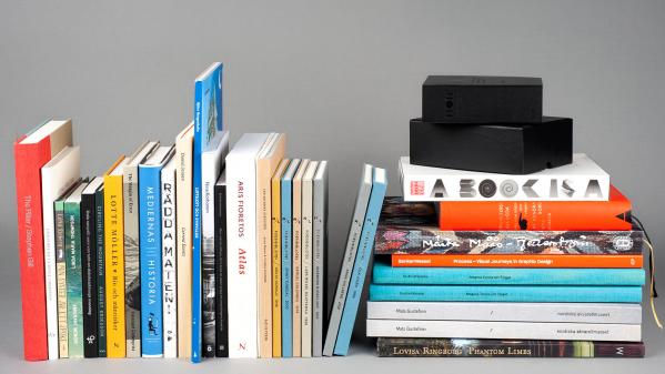
An interesting trend for 2019 is that a number of books have features which cannot be translated into a digital medium. The books are really created to be physical objects. This is extra clear from a look at all the entries – about 300 – to the competition. They include several examples of advanced image printing on spheres and the use of relief varnish on the covers. Many books contain important posters and other loose inserts. Some also hide small secrets that require exertion to discover.
The colour orange – as well as other bold colours like pink and yellow – also has a strong presence in the selection. This contrasts greatly to the 2018 entries, where more muted shades dominated. Orange is a signal colour that is often used to attract attention and require action. It would appear that 2019 book design, subconsciously or not, reflects the general sense of crisis in society.
2019 Jury
Björn Anderson – printer, Emanuel Cederqvist – photographer, Jonas Ellerström – publisher, Martin Högström – author, Roger Johansson – bookbinder, Sofia Scheutz – graphic designer, Ylva Sommerland – operations manager Svensk Bokkonst, Helena Willis – illustrator.
Svensk Bokkonst was founded in 1933 and now is a not-for-profit association that aims to stimulate and inspire the book industry to higher-quality book production.
